Insights Redesign
VanEck wanted to make a name for themselves in the over-crowded financial insights space. “We want to be Bloomberg” is what the client said, and we took that and ran with it.
Usually, the big problem when a client wants to corner a content market is the lack of content. VanEck did not have this issue. They had plenty, and were in a position to keep generating more. So the challenge became one of presentation, categorization, and priority.
(“Kill your darlings” worked for William Faulkner, but not so much for a proud client.)
The challenges we faced centered on finding a balance between restraint and excess, on putting as much information in front of a customer as comfort allowed, and being limited to only the Insights section of the website. (Before the project was over, we were able to redesign the navigation as well.)
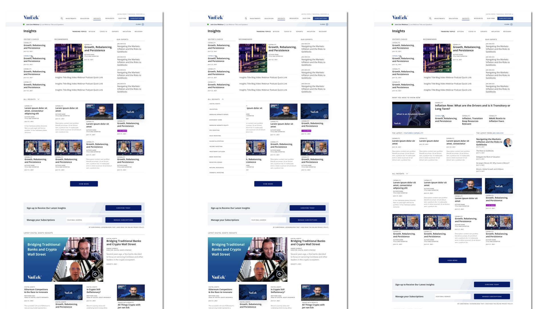
The solution? Borrow heavily from practices in online news media, leveraging modules and containers of various sizes to maintain a “headline-driven” look and feel. Give customers the means of drilling down to the news that mattered most. Use conditional alerts sparingly, surgically. And the introduction of an elegant modal assistant.